During Covid-19, Royal T Group launched a new brand, BossHappy, to place all food brands such as Paik's Bibim, NeNe Chicken and LiHO TEA, under one roof. BossHappy is created to promote deals and promotions for all brands, and also works as the branding for the in-house delivery platform.
With great urgency, a logo was quickly designed by another team member. However, with time, there is a need to create a new look for this brand.
While maintaining the same colour, the new look requires the inclusion of a character, Boss, into the logo. The words "BossHappy" was also included in the design to help raise awareness as it is a new brand. With these requirements, it came the birth of 2 new proposed designs.
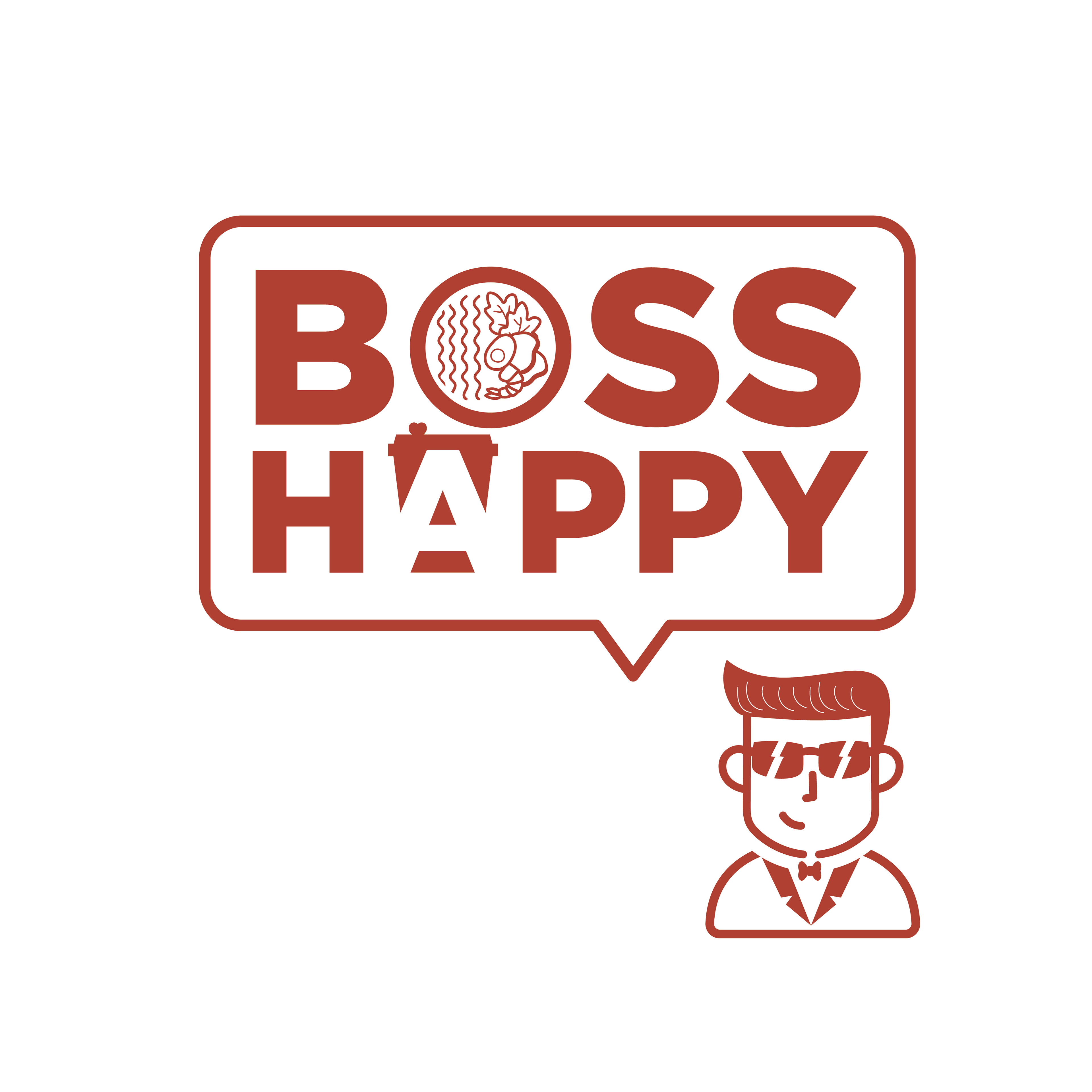
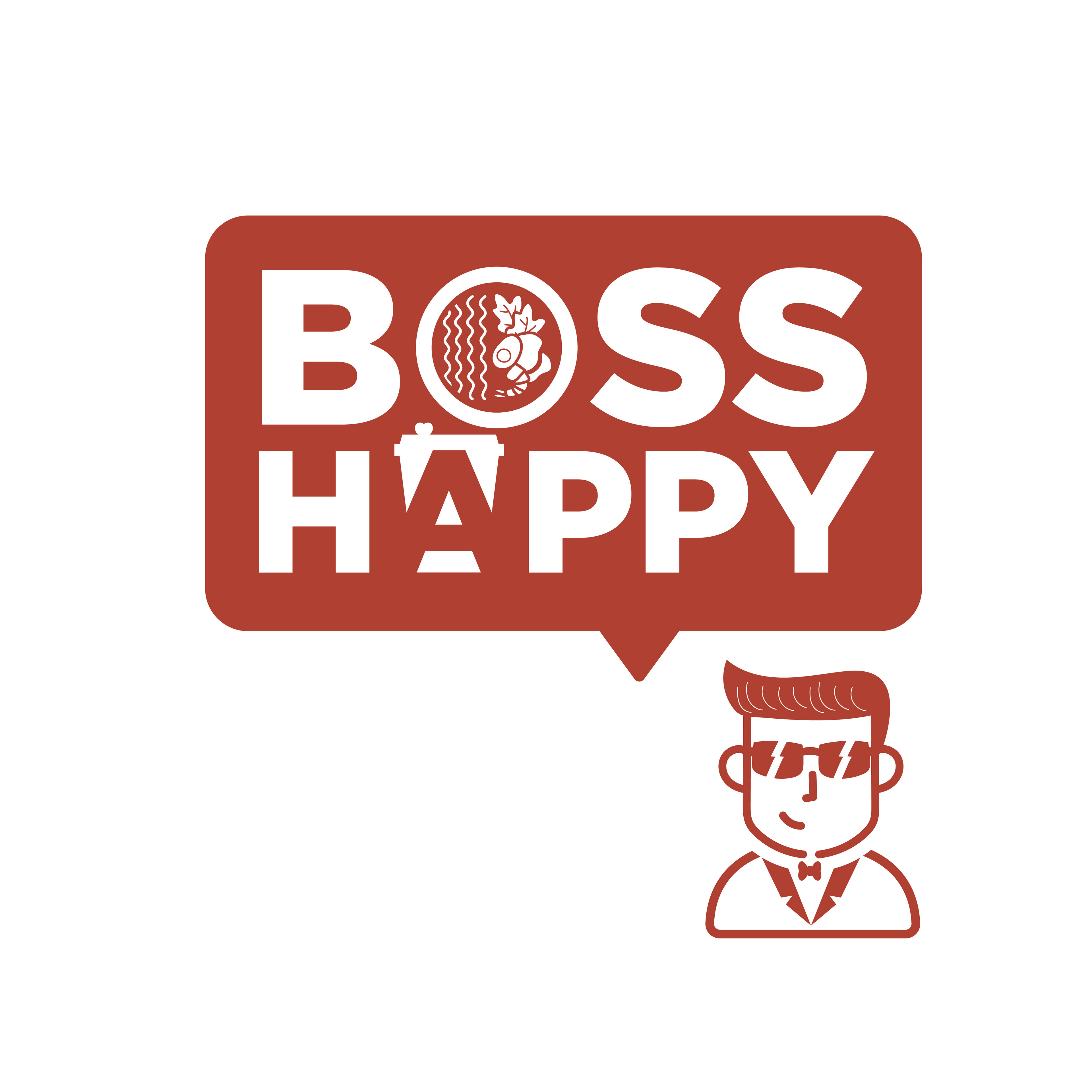
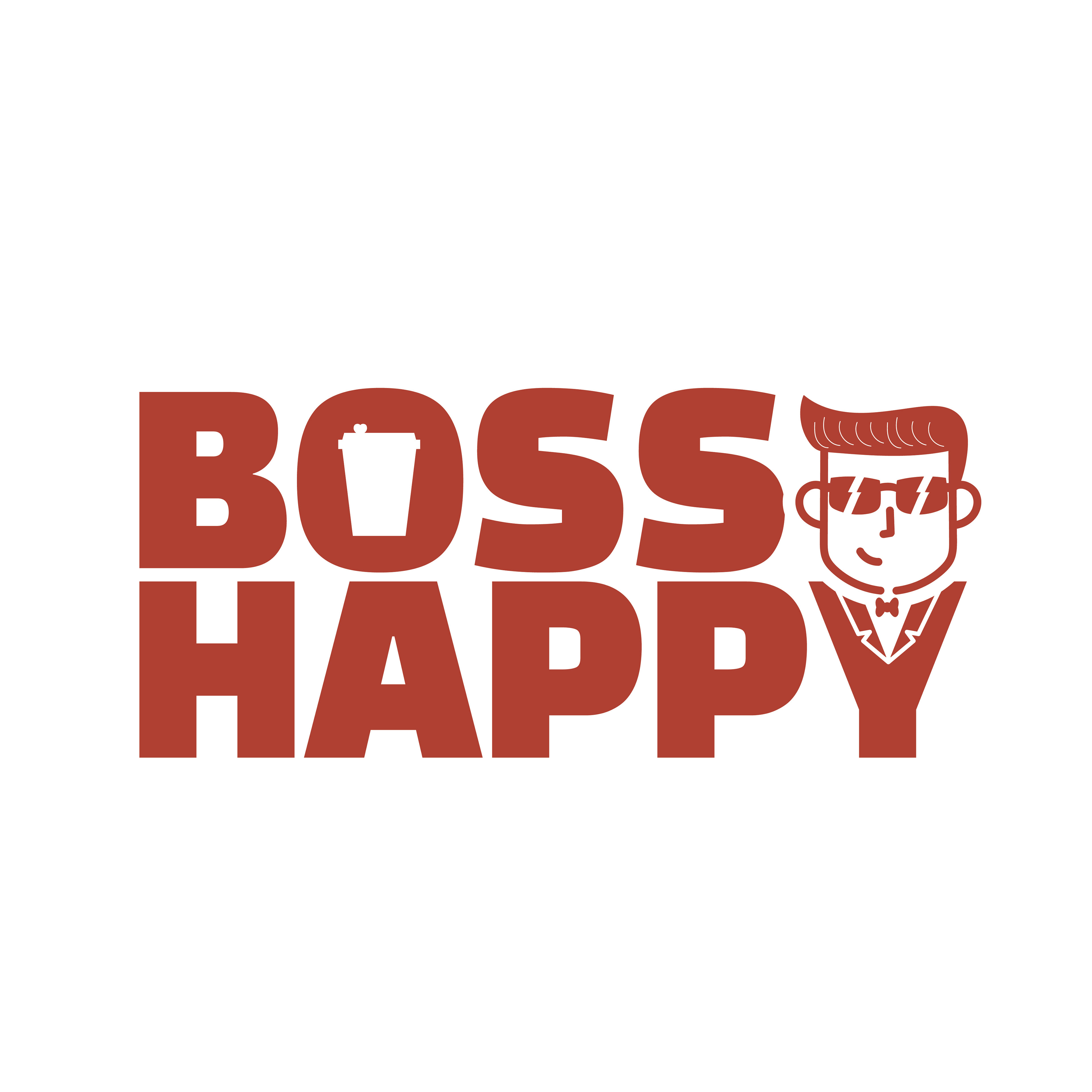
Design A
When coming up with the design concept, one of the main elements that was considered was the use of big and bold fonts. The font, Gotham, was often used in artwork across all food brands, and as it is a Sans Serif font, it easily became the no.1 choice for the logo design. The initial character was illustrated based on the actual boss' look. The character was made to look more like an icon, with simpler lines and also cooler with the sunglasses. The letter "Y" was also designed to be part of the character as it functions as the tuxedo. Keeping in mind that this is a Food & Beverage brand, a cup that symbolizes the signature LiHO TEA's cup was used to fill the negative space in the letter "O".
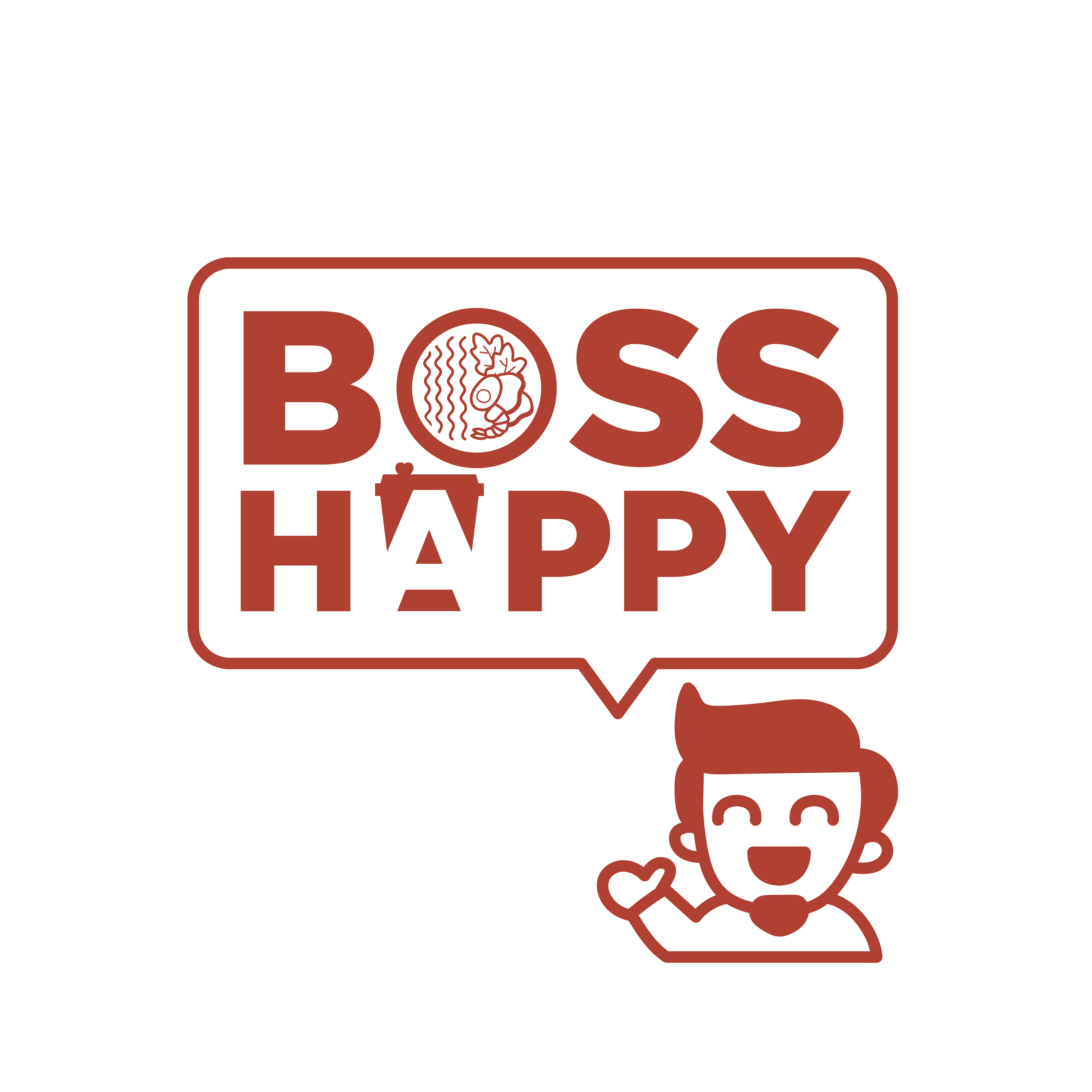
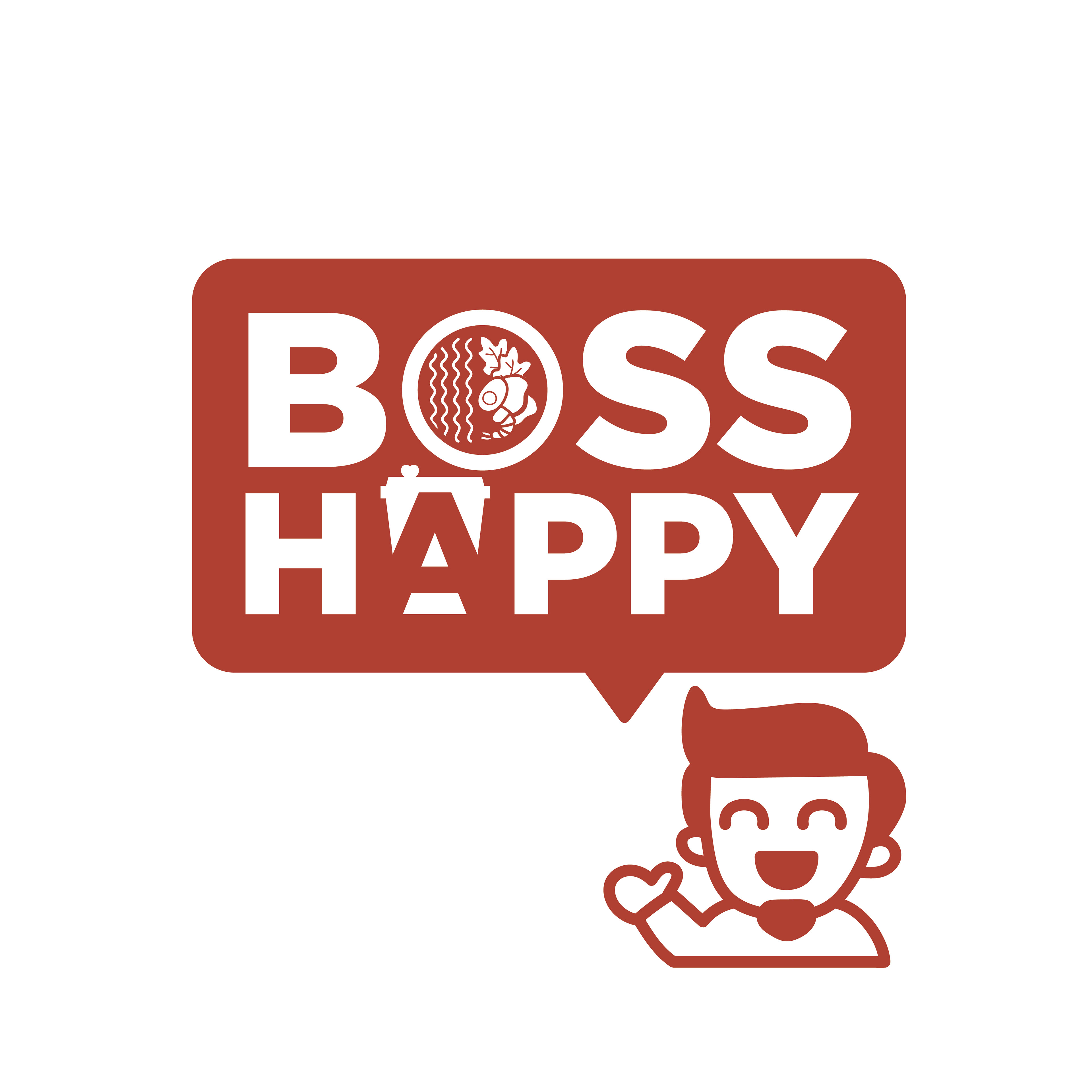
Design B
Design B incorporated what the brand is about, which is promoting the food and drinks. The letter "O" acts as a bowl filled with food, similar to the soup bowls that are sold in one of the food brands. The letter "A" was also created using the negative space of the signature LiHO TEA's cup. The use of a speech bubble was because LiHO TEA is well-known for using speech bubbles in their artwork. In addition, when Boss declares that he is happy, it is often followed with food deals and promotions.
With these 2 designs, a variety of design was created for the management to choose from.
